A TASTE OF SAGE was an impulse buy for me (aren't they always?). I'm a sucker for food-themed books, and the idea of an enemies-to-lovers romance between two rival chefs who both favor the cuisines of their childhood really spoke to me. Also, it's a bit of a workplace romance, too, because when Lumi's business goes under forcing her to job hunt, she ends up being forced to work for Julien.
I was shocked at how low the ratings were for this book... until I got to the halfway mark. You see, throughout this book, recipes are interspersed at key points so you can make the food the characters are talking about-- which is a great touch. Or it was, until one of the characters gets grievously injured in a kitchen and this horrendous accident is followed by... you guessed it. Another recipe.
Talk about tonal whiplash.
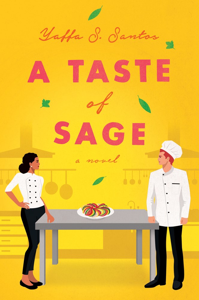
I think books like these are actually the perfect examples of situations where illustrated covers don't work. I saw a TikTok (I believe it was by chels_ebooks) that talked about how old skool romance covers were usually a pretty good indicator of the spice level (although not always). If the lady looked prim and dainty on the cover, it was a likely bet that it was going to be a "clean" regency romance. And if the lady was bursting out of her top in the aggressive embrace of the hero, the likelihood of spice (and probably dub-con) goes up in the mind of the person looking at the cover, and they can make their purchase accordingly.
When people look at illustrated covers, they picture light and sweet, so when a book has a cutesy cover but actually has really dark and depressing moments, readers can feel consciously or subconsciously cheated. I feel like a better cover for this book would have been a wooden table with photographs of food, and the table could be covered with chopped herbs. Maybe a picture of a knife in the foreground. I think that would have hinted at the food, the magic-realism, the homeyness, and also a little hint of menace (subconsciously) because of the knife. The illustrated cover here really does not work.
I actually really liked both characters and loved the recipes. I don't think this book is as bad as everyone says it is, but the tonal shift was definitely a game-changer that impacted my overall enjoyment of the book as a whole. But ultimately, the magic-realism, the ode to Dominican fusion, and the premise of two flawed and headstrong characters falling in love ended up saving the book for me. Just go into this book knowing that it gets a little miserable for a while halfway through, and if you or someone you know recently suffered from a bad burn, this could potentially be triggering.
2.5 to 3 out of 5 stars
No comments:
Post a Comment
Note: Only a member of this blog may post a comment.